


Top 10 Australian Company Logos
You should recognise these 10 logos of Australian companies; and that is because they all have 2 things in common. These 10 company logos were voted by an expert panel to be the top 10 logos of all time in a poll from Desk Top Magazine and MarketingMag.com.au. All of the companies that these logos belong to are all both popular and successful. So that begs the question, is some of the popularity of these companies a result of a recognisable and well branded logo, or do successful companies just have a knack for developing good logos?
10. SBS Television Station
![]()
This logo for the multi-cultural television station was introduced in 1991. It represents the global programming with the design; the ellipses are a translation of opening up the globe.
9. The Australia Post
![]()
The Australia’s Post’s “P” logo might be the most widespread logo in all of Australia since it is on just about every street corner and inside almost 11 million mailboxes every day. It is also the oldest surviving commercial enterprise in Australia. Longevity and success must have a recognisable logo.
8. Sydney Olympics
![]()
The Sydney Olympics was only a one-time event and was almost 14 years ago now; however, the logo is still so recognisable and a symbol of Australian pride. The logo was 7 years in the making from the time the Olympics were awarded to Sydney until the unveiling. The design combined the essence of the Olympics with an athlete running while holding the torch. The blue on the type is fashioned after the opera house and the runner is made up of 3 boomerangs.
7. Nine Network
![]()
The Nine Network logo has been around since 1970. Over the years it has gone through some minor design changes, but the 9 dots and the number 9 still remain.
6. Woolmark
![]()
The Woolmark Pure Wool logo was designed in 1963 to represent and symbolise the quality wool that the company exports all over the world. Over the years there has been controversy as to the original designer of the logo, however the one thing that is unmistakable, is that this logo works well to represent what it is intended to.
5. Woolworths
![]()
This is a well-known logo and trademark had a makeover in 2008. The new design incorporates the fresh food trademark and Woolworth’s “w” in the shape of an apple. The logo is both recognisable and has a universal message that is now synonymous with the food chain.
4. Commonwealth Bank
![]()
The overwhelming theme that Commonwealth Bank is looking for out of their new logo is “bold, strong, modern and progressive”. The company felt that their 1991 logo redesign embodiesd that idea that has also been present in its history of logos since 1921.
3. City of Melbourne
![]()
The city of Melbourne’s logo was developed in 2009 as part of its new corporate identity. It is a symbol of the modern cultural capital of the country. The logo is designed to appear multifaceted and three-dimensional.
2. Qantas Airlines
![]()
The famous logo that is known around the world has undergone some overhauls since its inception in 1944. The latest iteration of the logo design was unveiled in 2007 and the kangaroo reflects the changing structure of the airline’s new generation aircraft A380 super jumbos.
1. ABC
![]()
The ABC logo is known as “The Worm” and has been around since 1965. It has gone under several facelifts over the last 50 years to represents the changes in television history including colour in 1975, multimedia design in 2001, and the latest design overhaul was last year to represent the digital age and the split to ABC1 and ABC2.
HOT PRODUCTS
-
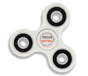
Branded Fiddle Spinners
Category : Puzzles, Games and ToysThese Fiddle Spinners can reduce stress & anxiety, improve focus, and alleviate boredom! Arriving 30-06-17, Pre-Order Available Now
Min Qty : 500
From : $3.31
VIEW DETAIL -
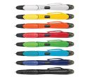
Nexus Multifunction Pen - Colour Barrels
Category : Highlighter PensRetractable plastic ball pen with a soft rubber grip, a stylus for use with touch screens and a Yellow highlighter.
Min Qty : 1000
From : $1.04
VIEW DETAIL -
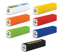
Tesla Power Banks
Category : IT & USB2200mAh power bank that is ideal for charging mobile phones, tablets, cameras, GPS, Bluetooth speakers and headphones etc
Min Qty : 100
From : $9.82
VIEW DETAIL -
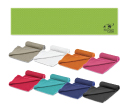
Yeti Cooling Towels
Category : SportswearIncredible towel which will cool up to 15 degrees below the outdoor temperature in seconds when wet. Simply wet, wring out and snap tight to remove the excess water
Min Qty : 250
From : $5.08
VIEW DETAIL


