


Top Logo Changes for Brands in 2014
Each year different brands decide to change their logo for various reasons. Some just want an updated look and some companies decide to rebrand and get a new logo to go along with the rebranding. In 2014, these companies redesigned their logo, some are subtle, quiet changes, and others were bold changes that went along with a host of PR and rebranding advertisements.
![]()
- Pizza Hut
Pizza Hut, is a U.S. based pizza chain that has restaurants and also competes with some of the largest delivery-only chains in the big pizza market. In late 2014, Pizza Hut introduced a host of new pizza flavors in an attempt to differentiate themselves from other delivery chains. With new flavors including salted pretzel crust, Thai curry, and fiery red pepper, they also adopted a new pizza-centric logo dropping the black font and using a red pizza shaped circular logo instead.
![]()
- Airbnb
Airbnb changed its logo from a blue bubble font to a light red clear font with a symbol in July. The symbol of the logo was met with some criticism but it really didn’t bother the company, explained founder Ben Wright. They named the symbol “Belo” and say that it represents “the universal symbol of belonging”.
![]()
HOT PRODUCTS
-
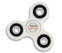
Branded Fiddle Spinners
Category : Puzzles, Games and ToysThese Fiddle Spinners can reduce stress & anxiety, improve focus, and alleviate boredom! Arriving 30-06-17, Pre-Order Available Now
Min Qty : 500
From : $3.31
VIEW DETAIL -
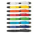
Nexus Multifunction Pen - Colour Barrels
Category : Highlighter PensRetractable plastic ball pen with a soft rubber grip, a stylus for use with touch screens and a Yellow highlighter.
Min Qty : 1000
From : $1.04
VIEW DETAIL -
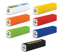
Tesla Power Banks
Category : IT & USB2200mAh power bank that is ideal for charging mobile phones, tablets, cameras, GPS, Bluetooth speakers and headphones etc
Min Qty : 100
From : $9.82
VIEW DETAIL -
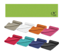
Yeti Cooling Towels
Category : SportswearIncredible towel which will cool up to 15 degrees below the outdoor temperature in seconds when wet. Simply wet, wring out and snap tight to remove the excess water
Min Qty : 250
From : $5.08
VIEW DETAIL


