


How Your Website Looks on Different Devices
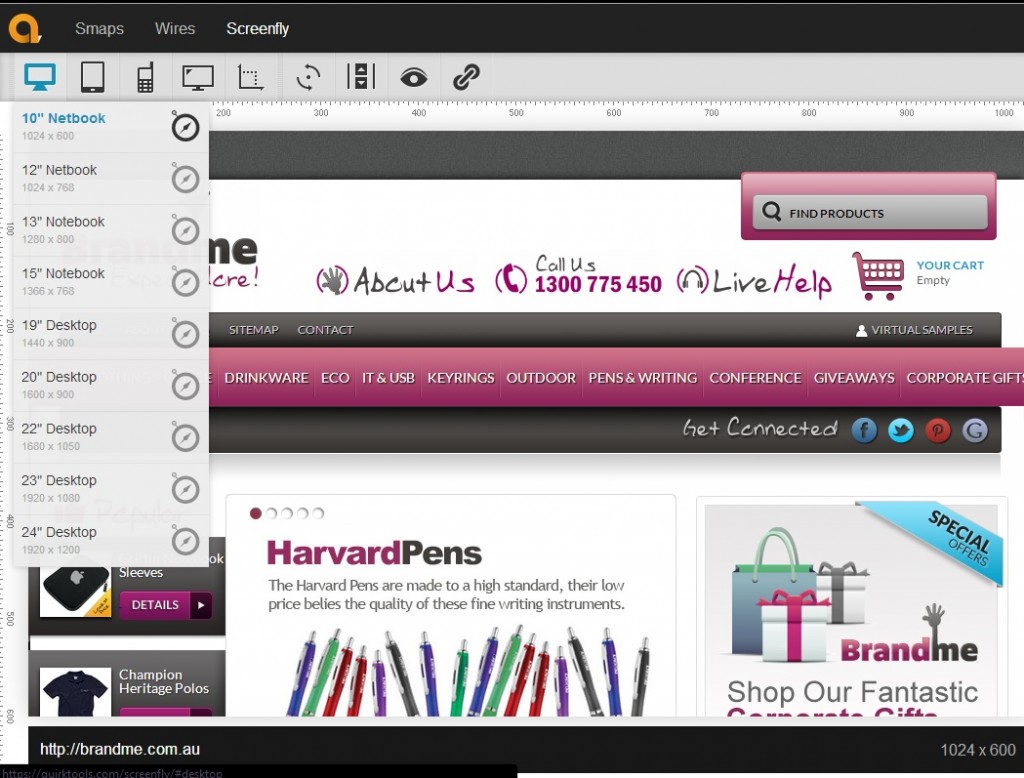
Are you wondering if you website is visible on all size devices? There is a handy free tool called ScreenFly that shows you what your website looks like on a number of different devices. Simply enter your URL into the screen and then you can select the type of device: computer screen, tablet, or smartphone and see if your website shows properly on each device. A drop down menu will appear for you to choose each device.
What should you do if your website does not show properly on all of these devices? The answer is that you need a responsive design, which is a style of design that shrinks to fit on any size screen and also ensures that your website can be navigated and easily read. This will lead to a higher conversion rate and more page views for your website.
For more on responsive design, check out our recent blog post on the topic.
HOT PRODUCTS
-
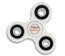
Branded Fiddle Spinners
Category : Puzzles, Games and ToysThese Fiddle Spinners can reduce stress & anxiety, improve focus, and alleviate boredom! Arriving 30-06-17, Pre-Order Available Now
Min Qty : 500
From : $3.31
VIEW DETAIL -
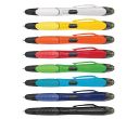
Nexus Multifunction Pen - Colour Barrels
Category : Highlighter PensRetractable plastic ball pen with a soft rubber grip, a stylus for use with touch screens and a Yellow highlighter.
Min Qty : 1000
From : $1.04
VIEW DETAIL -
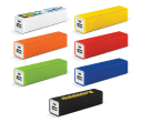
Tesla Power Banks
Category : IT & USB2200mAh power bank that is ideal for charging mobile phones, tablets, cameras, GPS, Bluetooth speakers and headphones etc
Min Qty : 100
From : $9.82
VIEW DETAIL -
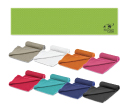
Yeti Cooling Towels
Category : SportswearIncredible towel which will cool up to 15 degrees below the outdoor temperature in seconds when wet. Simply wet, wring out and snap tight to remove the excess water
Min Qty : 250
From : $5.08
VIEW DETAIL


