


Surge in Mobile Searches Increases Need for Responsive Website Design
Mobile search is increasing exponentially. With tablets and smartphones becoming more popular by the day, it means that more searches are conducted on these mobile devices, and that is where the responsive design comes in. Responsive design is the style of design that ensures that your website will show up on any size phone or tablet.
The days of websites being accessed only on a desk top computer or laptop are gone. New studies predict that tablets will outsell desktops this year. In the e-commerce space, “mobile commerce is a super big deal,” asserted First Round Capital Partner Chris Fralic. In the fourth quarter of 2012, he said, 13% of all e-commerce was mobile commerce.
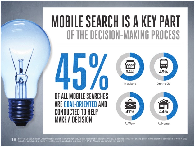
A Google study on mobile search reveals how the mobile search is growing. Mobile search habits reflect online shopping and influence purchasing decisions for both brick and mortar businesses as well as online retailers. In addition, mobile searches are not always done “one the go”, for convenience reasons many searches on mobile devices are done while at home or at work.
HOT PRODUCTS
-
Branded Fiddle Spinners
Category : Puzzles, Games and ToysThese Fiddle Spinners can reduce stress & anxiety, improve focus, and alleviate boredom! Arriving 30-06-17, Pre-Order Available Now
Min Qty : 500
From : $3.31
VIEW DETAIL -
Nexus Multifunction Pen - Colour Barrels
Category : Highlighter PensRetractable plastic ball pen with a soft rubber grip, a stylus for use with touch screens and a Yellow highlighter.
Min Qty : 1000
From : $1.04
VIEW DETAIL -
Tesla Power Banks
Category : IT & USB2200mAh power bank that is ideal for charging mobile phones, tablets, cameras, GPS, Bluetooth speakers and headphones etc
Min Qty : 100
From : $9.82
VIEW DETAIL -
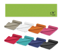
Yeti Cooling Towels
Category : SportswearIncredible towel which will cool up to 15 degrees below the outdoor temperature in seconds when wet. Simply wet, wring out and snap tight to remove the excess water
Min Qty : 250
From : $5.08
VIEW DETAIL


