


What Colours Mean for Your Logo
The colours used in your logo are probably more important that you think. Colour can instantly convey a message and invoke feelings. Your business logo design combined with colour can immediately tell a consumer a great deal about your brand. Here is some information on what colours can mean to your brand so that you are getting the right message across to your target customers.
Red is a colour that can have different meanings, so be cautious about how you use red in your logo. Red is a strong colour that has been said to activate the pituitary gland and increase heart rate and make people breathe rapidly. It can mean love, passion, sportiness, or aggression. In many cases it represents blood, danger, indebtedness, or means stop. Therefore, it is important to be careful how you use this colour and for logos it can be effectively used for accents or to represent what you feel is strong about your company. Some famous companies with red in their logo are CNN, Coca-cola, Toyota, and Adobe.
Yellow represents fun, happiness, sunshine and is a cheerful and energetic colour. Yellow is the brightest colour to the human eye and because of that, is used to represent the sun in just about every culture on Earth. Be careful about yellow, because it can also invoke some negative feelings like cowardice or caution. When using yellow in your logo, be sure that it is in a position where it stands out and is bright. Behind a while background yellow can be hard to be seen. Yellow can help your company convey positivity, hope, joy and warmth. Companies that use yellow successfully in their logos are McDonald’s, Good Year, Subway, and Best Buy.
Orange is the combination of red and yellow and therefore, it invokes a combination of the same feelings. Orange is bright and warm and very youthful. Much like red increases the heartbeat, orange increases oxygen and stimulates brain activity of the person gazing at the colour. What can orange mean for your logo? It can represent fire, sun, fun, warmth or tropical images. Tropical travel destinations, health companies, and children’s companies should consider using orange in their logo. Companies that successfully use orange to represent these aspects are Nickelodeon, Burger King, and Blogger.
Green represents Earth, nature, growth and money. Green is usually a relaxing colour and can have a healing touch. Many nutritional, safety, and pharmaceutical companies use green to represent healing; dark green can represent the military, money, or banking. The one thing to be careful about with green is that it can also be associated with greed and envy. However, when green is used right, it can be used to represent freshness, calm, wealth, or the environment, as most environmentally friendly designs are in green. Successful companies with green in their logo are Starbucks, TicTac, Sprite, and Cooking Channel.
Blue is the most popular logo colour and is widely used to mean different things. Blue is thought of as a calming colour; however, it also represents loyalty, strength, stability, wisdom and trust. Unlike red or orange, when people look at blue it has a cool and calming effect. Since blue is the colour of the sky and the sea, it is often used in company logos to represent the same aspects, so boating and airline companies often have blue in their designs. Many social media companies have blue in their logo: Twitter, Facebook, LinkedIn and Skype all have blue logos. Other successful companies using blue logos are hospitals, IBM, and Ford.
HOT PRODUCTS
-

Branded Fiddle Spinners
Category : Puzzles, Games and ToysThese Fiddle Spinners can reduce stress & anxiety, improve focus, and alleviate boredom! Arriving 30-06-17, Pre-Order Available Now
Min Qty : 500
From : $3.31
VIEW DETAIL -
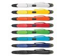
Nexus Multifunction Pen - Colour Barrels
Category : Highlighter PensRetractable plastic ball pen with a soft rubber grip, a stylus for use with touch screens and a Yellow highlighter.
Min Qty : 1000
From : $1.04
VIEW DETAIL -
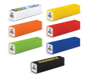
Tesla Power Banks
Category : IT & USB2200mAh power bank that is ideal for charging mobile phones, tablets, cameras, GPS, Bluetooth speakers and headphones etc
Min Qty : 100
From : $9.82
VIEW DETAIL -
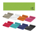
Yeti Cooling Towels
Category : SportswearIncredible towel which will cool up to 15 degrees below the outdoor temperature in seconds when wet. Simply wet, wring out and snap tight to remove the excess water
Min Qty : 250
From : $5.08
VIEW DETAIL


