


Facebook Rolling Out New Timeline Design
“To improve is to change; to be perfect is to change often.” – Winston Churchill
Mark Zuckerberg and staff are evidently adopting Churchill’s way of thinking with all of the changes that Facebook goes through. If there is one thing that remains constant about Facebook, it’s that it is always changing. Despite the fact the users seem to get more than just angry about the changes, Facebook continues to make drastic adjustments to the look and feel of their site as they seek out the perfect mix of user interaction, advertising, and now, satisfied share holders. Users just end up dealing with it and they figure out how to adapt to the change and remain loyal a on the social network, not just as average users, but avidly use it on a daily basis.
Brace yourselves! This week, Facebook will once again be making a major design change. It’s the first major design change roll out since Timeline was launched a little over a year ago. The new designs were first released to users in New Zealand last week, so at least we have a preview of the changes to come. The new changes include a single column layout, condensed tool bar, timeline navigation moved to the top right, and photos, maps, and likes have been moved from the header to their own click through modules. The overall consensus of those who were able to get a sneak preview of the new design tests said that the new design lends itself to ease of navigation and more privacy for users.
While some Facebook power users were able to start test driving the new design as early as last November, it just began roll out last week in New Zealand and will be part of a big media announcement from Facebook on 7 March 2013. Mashable provided a preview of the new look as it is live in New Zealand.
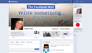
Here is a screenshot of the old design:
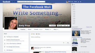
Here is a screenshot of the new design:
HOT PRODUCTS
-
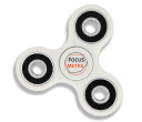
Branded Fiddle Spinners
Category : Puzzles, Games and ToysThese Fiddle Spinners can reduce stress & anxiety, improve focus, and alleviate boredom! Arriving 30-06-17, Pre-Order Available Now
Min Qty : 500
From : $3.31
VIEW DETAIL -
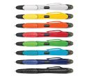
Nexus Multifunction Pen - Colour Barrels
Category : Highlighter PensRetractable plastic ball pen with a soft rubber grip, a stylus for use with touch screens and a Yellow highlighter.
Min Qty : 1000
From : $1.04
VIEW DETAIL -
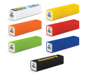
Tesla Power Banks
Category : IT & USB2200mAh power bank that is ideal for charging mobile phones, tablets, cameras, GPS, Bluetooth speakers and headphones etc
Min Qty : 100
From : $9.82
VIEW DETAIL -
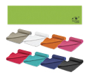
Yeti Cooling Towels
Category : SportswearIncredible towel which will cool up to 15 degrees below the outdoor temperature in seconds when wet. Simply wet, wring out and snap tight to remove the excess water
Min Qty : 250
From : $5.08
VIEW DETAIL


