


Marketing With a KISS
If you’re a marketer, most likely you’re using a Website to promote and market your products. You want to have all the latest bells and whistles on your site, but you don’t want to drive people away, because let‘s face it, when it comes to the Web you already forgotten more than some people will ever know. All Websites are different, some serve different purposes than others, and the subject matter may dictate how much–or how little–”style” a Website needs.
 All that aside, KISS. Which stands for Keep It Simple, Stupid. Of course, we’re not referring to anyone reading this as stupid, it’s just a colloquialism, if you will.
It’s understandable that one would want as much “stuff” on the Website page as possible. After all, if you’re conveying information, then you want to put as much of it out there as possible. This is not a new problem. The people who design newspaper front pages have been dealing with it forever.
Look from Their Point of View
But, when designing a Web page, try to look at the exercise from the viewer’s point of view, rather than the publisher’s. We already know that the publisher wants to get as much stuff as possible up, but does the viewer want to read it?
Let’s take a look at a few Websites as illustration.
Bing is perhaps the best designed site I have seen. Instead of confronting the reader with a giant pile of type, Bing presents a screen wide photo, usually depicting something in nature or a city scene. It’s purposely not “newsy.” The photos, by the way, are embedded with little “talking points” about the photo for added interest. It is, I believe, one of the first “elegant” style sites which have purposely veered away from the “pile of type” design.
It’s All About Navigation
Another is Rhapsody.com. A subscription music service, Rhapsody makes judicious use of multi-media, music, album cover, and the media player to present a site with millions of tracks which doesn’t look like millions of tracks. The type is all about navigation: a list of genres, new releases, recommended albums, a browse feature and my music, a list of songs you’ve already played. For something as busy as a music Website, Rhapsody has a refreshingly uncluttered look.
It’s an important issue given the chaos that sits on our desktops. Multiple sites might be open at the same time, with Skype and Garage Band and the rest. The Web experience is built for skipping around, and unless it’s clear to read about who we are and what we’re about in a moment or two, readers may give up and move on.
Market from a Website you’re proud of, just make sure you’re not overwhelming your customers.
HOT PRODUCTS
-
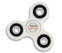
Branded Fiddle Spinners
Category : Puzzles, Games and ToysThese Fiddle Spinners can reduce stress & anxiety, improve focus, and alleviate boredom! Arriving 30-06-17, Pre-Order Available Now
Min Qty : 500
From : $3.31
VIEW DETAIL -
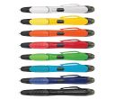
Nexus Multifunction Pen - Colour Barrels
Category : Highlighter PensRetractable plastic ball pen with a soft rubber grip, a stylus for use with touch screens and a Yellow highlighter.
Min Qty : 1000
From : $1.04
VIEW DETAIL -
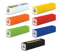
Tesla Power Banks
Category : IT & USB2200mAh power bank that is ideal for charging mobile phones, tablets, cameras, GPS, Bluetooth speakers and headphones etc
Min Qty : 100
From : $9.82
VIEW DETAIL -
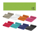
Yeti Cooling Towels
Category : SportswearIncredible towel which will cool up to 15 degrees below the outdoor temperature in seconds when wet. Simply wet, wring out and snap tight to remove the excess water
Min Qty : 250
From : $5.08
VIEW DETAIL


