


Best Practices for Trade Show Booth Design
Making sure that your trade show booth design does its job and attracts the attention of attendees is one of the most important things you can do as an exhibitor. Even though you might not have a graphic designer to design the elements of your booth, you can still follow some of these simple guidelines to ensure that your both design is doing its job and getting you leads. Ensuring the highest level of readability and legibility are two steps in the right direction and vital best practices when it comes to trade show booth design. The design and presentation of your booth makes a big impression on attendees, as it is the first thing they see. Follow these tips to get your booth design to boost attendance and engagement throughout your trade show.

Best Practices and General Tips for Trade Show Booth Design
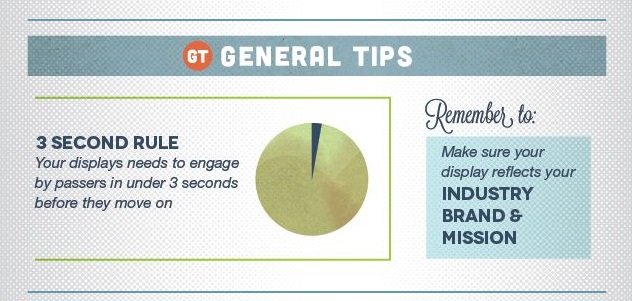
Did you know? There is a “3 Second Rule” in trade show attendance. Your display has to grab the attention of attendees before they pass you by.
It is important that your booth design and messaging immediately lets potential customers know your industry and brand mission.
Best Practices for Trade Show Booth Graphics
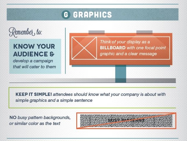
- Target your audience. Do you know who your target audience is? Develop wording and jargon they will understand and that appeals to your specific audience.
- Graphics and messaging should be clear as if it is a billboard.
- Stand by the good old rule of “keeping it simple”. The people who pass by your booth should instantly know what your company is about. Use simple graphics and simple sentences that can be seen from far away.
- Busy patterns are a no-no because they make it hard for passersby to quickly and easily read your message. The same goes for same or similar colour backgrounds. Do a check and make sure that others can read it, you already know what it says so it is easier for you to read than strangers.
Best Practices for Trade Show Booth Colours
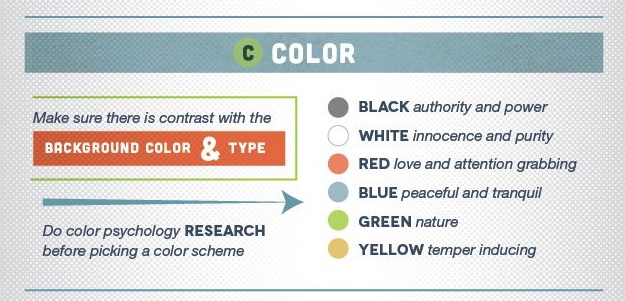
Have you done colour psychology research? This should be done for your logo and design but also before picking a colour scheme for your trade show booth.
- Black = authority and power
- White = innocence and purity
- Red = love and attention grabbing
- Blue = peaceful and tranquil
- Green = nature
- Yellow = temper inducing
Best Practices for Trade Show Booth Typography
This is where the tips come in to help you if you don’t have a graphic designer to do the signage or digital graphic designs for your trade show booth. Using these tips will help you learn the best practices for the typography and fonts for your design.
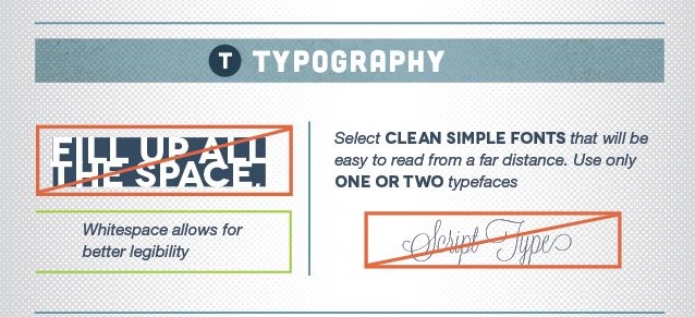
- Don’t fill all the space in just to make the font larger. Whitespace helps define and make your wording more legible.
- Select a clean and simple font. The idea of trying something fancy often backfires because it is not easily seen from afar; sometimes others can’t even see it up close. Remember to ask someone else to read it for you. Since you already know what it says, it is easy for you to read it.
Best Practices for Trade Show Booth Layout
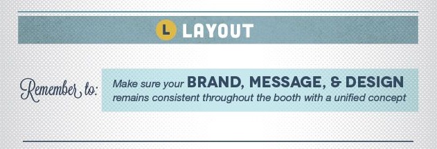
Keep the same messaging throughout your entire design process. Consistent messaging is just as important in your trade show graphics and messaging as it is for your booth staff. See the graphics below to help you with the design layout from the front and top views.
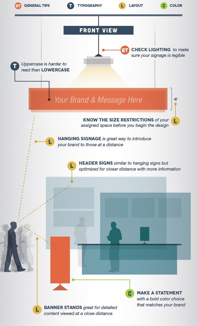
Infographic Photo Credit: Pinterest
HOT PRODUCTS
-
Branded Fiddle Spinners
Category : Puzzles, Games and ToysThese Fiddle Spinners can reduce stress & anxiety, improve focus, and alleviate boredom! Arriving 30-06-17, Pre-Order Available Now
Min Qty : 500
From : $3.31
VIEW DETAIL -
Nexus Multifunction Pen - Colour Barrels
Category : Highlighter PensRetractable plastic ball pen with a soft rubber grip, a stylus for use with touch screens and a Yellow highlighter.
Min Qty : 1000
From : $1.04
VIEW DETAIL -
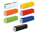
Tesla Power Banks
Category : IT & USB2200mAh power bank that is ideal for charging mobile phones, tablets, cameras, GPS, Bluetooth speakers and headphones etc
Min Qty : 100
From : $9.82
VIEW DETAIL -
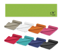
Yeti Cooling Towels
Category : SportswearIncredible towel which will cool up to 15 degrees below the outdoor temperature in seconds when wet. Simply wet, wring out and snap tight to remove the excess water
Min Qty : 250
From : $5.08
VIEW DETAIL


