


How to Build an Analytics Dashboard
An analytics dashboard is a customised dashboard that you set up for your business. Why make an analytics dashboard? It helps you finally make sense of Google Analytics figures and track changes from week to week and month to month for the parameters that mean the most to you. This allows you to have an Excel or Google Docs Spreadsheet where you can see your analytics statistics at a glance. It is great for board meetings, inter-office meetings, or ways to show your boss or owner where your traffic comes from, how your campaigns are doing, and identify strengths, weaknesses, and areas of opportunity. In this post, we will show you how to build your own analytics dashboard; but always remember that you can choose to use the specific aspects of analytics mean the most to you.
Creating the Dashboard
Open a new Google Spreadsheet or Excel Spreadsheet. Label each tab. There are six tabs: monthly comparison, weekly comparison, social traffic, organic traffic, referral traffic, and paid traffic. The following screen shots of sheets have the statistics that we use, so that you may see an example; however, you can change the parameters as you see necessary.
Monthly Comparison Sheet
For a monthly comparison, this sheet gives you information at a glance so that you can see the amount of visitors, unique visitors, page views, etc. In this screen shot, the numbers are not filled in, so the calculation doesn’t show up, but the field that sais #DIV/0! Will show the change or difference in percent the formula is =(B6/D6)-1 Where B6 is the column and row to the left and DC is the column and row to the right. If your company does sales or other conversions that are set up in Google Analytics, you can track those monthly changes on this sheet as well. Another great feature you can add into the dashboard is projected monthly totals. Based on the amount of traffic or conversion thus far, you can multiply the daily average times days in the month to calculate the projected monthly total.
Weekly Comparison Sheet
The weekly comparison dashboard sheet has the same parameters as the monthly one, but it is just calculated week over week instead of month over month. The weekly listing helps you track changes over time. You can also add a column for averages that divides the total by the number of weeks to get the weekly average numbers.
Social Traffic Comparison Sheet
The social comparison sheet is slightly different in that we can also use it to track changes in likes and interaction or engagement using each pages insights in addition to Google Analytics statistics on social, which can show you how much traffic is being sent via social channels and if they lead to conversions or goals on your website.
Organic Traffic Comparison Sheet
For the organic traffic sheet, it allows you to track traffic from your site’s organic rankings. You can compare organic to total visitors and see how many are new visitors, the bounce rate, how many pages per session and transactions or goal conversions. You can easily see all these figures at a glance.
Paid Traffic Comparison Sheet
For the paid traffic sheet, it allows you to track traffic from your site’s paid traffic. It can feature the same metrics as the organic, but will let you know how your Adwords campaigns and any other paid advertising efforts are performing.
Referral Traffic Comparison Sheet
For the referral traffic sheet, it allows you to track traffic from your site’s referred visitors. Knowing where your visitors were before they arrived on your site is a great benefit now especially since Google Analytics does not report keywords search data any longer.
HOT PRODUCTS
-

Branded Fiddle Spinners
Category : Puzzles, Games and ToysThese Fiddle Spinners can reduce stress & anxiety, improve focus, and alleviate boredom! Arriving 30-06-17, Pre-Order Available Now
Min Qty : 500
From : $3.31
VIEW DETAIL -
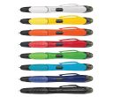
Nexus Multifunction Pen - Colour Barrels
Category : Highlighter PensRetractable plastic ball pen with a soft rubber grip, a stylus for use with touch screens and a Yellow highlighter.
Min Qty : 1000
From : $1.04
VIEW DETAIL -
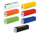
Tesla Power Banks
Category : IT & USB2200mAh power bank that is ideal for charging mobile phones, tablets, cameras, GPS, Bluetooth speakers and headphones etc
Min Qty : 100
From : $9.82
VIEW DETAIL -
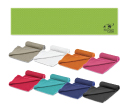
Yeti Cooling Towels
Category : SportswearIncredible towel which will cool up to 15 degrees below the outdoor temperature in seconds when wet. Simply wet, wring out and snap tight to remove the excess water
Min Qty : 250
From : $5.08
VIEW DETAIL


